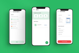
Cedispace Web App Design
Creating an easier and hassle-free hunt for the perfect space for any activity.
The hunt for the best space or venue for any activity always proves to be a strenuous and daunting task for most Ghanaians.
Cedispace seeks to address that issue. An online marketplace for booking the perfect space for any activity.
Here’s an account of how I contributed to the platform’s launch, making the space searching experience stress-free.
Role
I was the Designer as part of a 3-member team. My core responsibilities were to conduct user research, ideate concepts, and create final designs of the MVP.
Methods
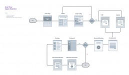
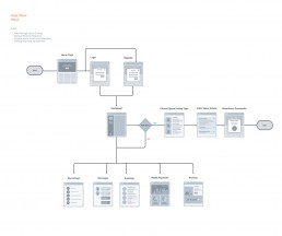
User Interviews, User Persona, User Flow, Sketching & Design, Prototyping & Iterating
Timeline
4-week sprint (June 2021 – July 2021)
Challenge
Discovering a variety of spaces at a sitting
As part of a team, we were tasked by the client to develop an app in less than 8 weeks with two main objectives – to create a seamless experience for searching and booking spaces; and to allow owners of under-utilized spaces to list and monetize their spaces.
Project Kickoff
Understanding the experience
Adopting a lean UX approach, with rapid user feedback, wireframing, and prototyping the MVP, I kicked off intending to understand the existing experience of looking for places.
I conducted in-person interviews with 4 users from the given target to gain valuable insights into both the searching and booking of spaces and the rentals of such spaces.
To empathize with the potential users, these were the main questions that drove the interviews:
For those in search of venues
- How was the process involved in searching for a place like?
- How did they feel about the process?
- What was their expectation of the place before booking?
- Were their expectations met upon booking?
- Will they ever recommend the place?
- Are there places they liked but weren’t a priority and will like to book for another time?
For those who share/wish to share their spaces
- How do they feel about sharing their spaces?
- What do they find challenging about sharing spaces?
- How do they go about marketing the availability of their spaces?
Discovery
What do the users care for?
The interview sessions helped to get valuable information about the target users and their experiences. After synthesizing the trends from their feedback, this is what was said:
? Behaviours
Search for their spaces from social media or google search
? Pain points
It was frustrating finding the ideal space for their activity
?? Wish lists
Access to a variety of spaces in one place/platform
? Behaviours
Although open to sharing, they barely do so
? Pain points
Afraid their space will be vandalized when sharing
?? Wish lists
Wants to earn some money from their spaces
User Personas
Meet our audience
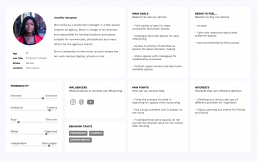
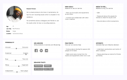
Based on the objectives and our initial findings we identified two main persona types. These personas helped guide my design decisions and constantly reminded the team to put the users’ needs first before any app feature requests/ideas.
For each persona type, we identified their key goals (for example, what they need to accomplish), as well as their pain points and emotional state throughout the journey
User Feedback and Improvements
High fidelity iterations
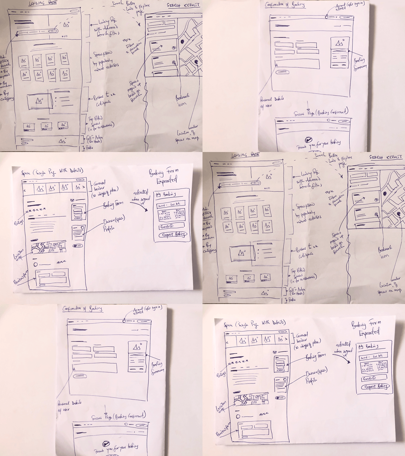
Because of the time constraints, I jumped from sketches to high-fidelity prototypes to give a realistic experience. It was also to help gain valuable feedback quickly.
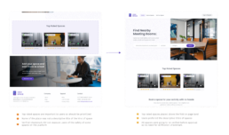
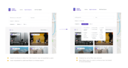
Based on the feedback received, I made improvements that were appreciated and ready after several iterations and testing.
Top rated spaces on landing page
More filters for Advanced Search
The Outcome
A seamless space searching and booking experience
Project Takeaway
Reflections and learnings
The product was launched in late August 2021. Although new in the market, it has already received some amount of positive feedback from users and is being tracked using Hotjar to monitor the behaviours of users on the app.
It was a challenging experience yet rewarding due to some of the lessons I learned which are I have recollected here:
Budget or time constraints should not eliminate research
Being made aware of the cost and time limitations my team and I were almost at the brink of foregoing research and jump straight to work based on similar products which we had worked on. It would have been a regrettable decision since the research (be it little) gave us very valuable insights which hugely impacted the clients’ feature requests and ideas we already had in mind to implement.
Disagreements present learning opportunities
Amongst the team and between our clients, there were times where we disagreed on certain design decisions. Fortunately, we did not let that hamper the process. The users’ feedback on the prototypes echoed certain brainstormed ideas and gave a better perspective on some proposed features. I learned that in such times, always go to the user for your answers!

