Medpharma Mobile App Redesign
Delivering medication and healthcare at your convenience
We live in an era where the impact of technology in healthcare can not be understated. Convenience and healthcare are non-negotiables to the average Ghanaian.
This is an account of me redesigning Medpharma – a mobile app that aggregates health care providers to deliver medication at patients’ convenience.
Role
As part of a 2-member team, I was solely responsible for all aspects of design. I led the implementation of the experience design strategy and I was also responsible for the creation of high fidelity screens and final designs of the product
Methods
Business Analysis, User Interviews, Problem Statement, User Flow, Sketching & Design, Prototyping
Timeline
2-week sprint (July 2019)
Challenge
A pharmacy at your fingertips
I was approached by Medpharma Alliance International Ltd. to help them deliver healthcare services at the convenience of their patients. This involved redesigning their mobile app and ensuring a seamless experience for placing medication orders to be delivered to their users.
Why a redesign?
Reviewing the existing app
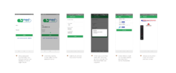
If a redesign was crucial, then I needed to know what aspects and how much of the existing MVP needed improvement. Being a new user myself with no knowledge about the product, I decided to immerse myself in the experience. I encountered some challenges on almost all the screens which definitely needed improvements. Here are those major issues with the bad experience:
Key Takeaways
From the review, it was clear that at least, the aspects that needed to be improved were:
- Onboarding experience – better communication throughout the journey to ensure familiarisation
- Adding prescriptions – easier way to add prescriptions for an order
- Order and checkout flow/process – attending to all hiccups during the ordering process
- Order details – ensuring users could easily get access to their order history
User Research
From the users' own mouths
The app review gave a fair understanding of what the task involved, but that alone was not enough. I decided to conduct some qualitative research with the aim of understanding the users, their specific needs and also to glean from their experiences with their app as well as their general healthcare service process to provide a solution tailored to their situations.
Here’s what I learned after conducting interviews with a few users:
Shared frustration about the app's experiences
Users shared similar frustrations as I did when trying to complete certain tasks on the app.
Different means of purchasing medications
The users had varying ways of obtaining medications from their local pharmacies. Some purchased them with or without prescriptions and paid either using insurance, cash, or digital wallets
Difficulty in reading out doctors' prescriptions
Due to the illegibility of some doctors' handwritten prescriptions, the users were unable to type out the right medication for their order while using the app.
Problem Statement
Defining the problem
From my learnings during the app review and the user interview sessions, I was ready to get straight into the designs. I had to be certain I understood the problem which prompted the need for a new solution and also to ensure that both clients’ business goals and users’ goals were aligned.
??♂️ User Goals
- Place order for medication
- Upload prescriptions from health professionals
- Purchase medication conveniently
? Business Goals
- Ensure users keep using the app
- Close the patient-doctor ratio
- Deliver drugs and healthcare at the point of need of users
Problem Statement
The Medpharma user needs a way to place an order for medications and conveniently purchase them for delivery.
Design Concepts and Sketches
Facilitating the delivery of patients' prescriptions at their convenience
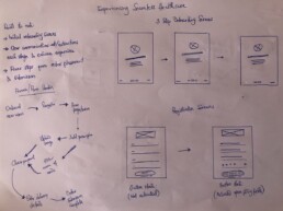
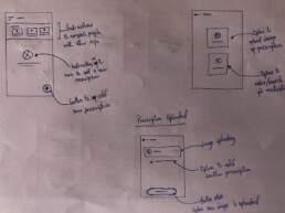
To better understand the processes involved I opted to map my flows and sketch my designs on paper. This helped me to work faster and visualize what aspects of the product could further ease the frustrations of the user.
User feedback and improvements
Design Iterations
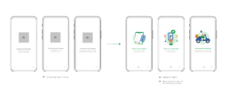
I proceeded by using Figma to produce the medium-fidelity and high-fidelity prototypes of the design. This was very helpful in giving a realistic experience to encourage useful feedback.
On-boarding process
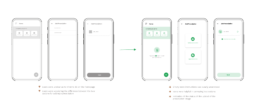
Home screen empty state confusion & unclear instructions
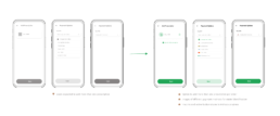
Placing prescription order
Final Design & Prototype
Pharmacy on demand
The final design of the screens needed to be simple, presenting the necessary information or action prompts so as to ensure the experience was easy and seamless.
I also worked with the developer via video calls to ensure the designs and interactions were effectively executed.
Project Takeaway
Reflections and learnings
This project was a great learning experience for me since it was the first mobile app project I had undertaken in the healthcare space. I was privy to some information that I had no knowledge of which grew my empathy both for patients, healthcare providers, and healthcare businesses. Here are some of the lessons I learned which I am grateful for:
There’s more to a successful product than just a launch
Inasmuch as the product was a brilliant idea and gaining traction, there were some challenges in terms of healthcare providers being responsive with their services and bottlenecks with healthcare regulatory process that had affected the business and the product in the early stages
Growth is a never-ending process
Looking back at the designs, there were things I would have loved to incorporate which would have been beneficial to users and added to the seamless experience. It made me appreciate that growth is one of our core essences as designers and there’s always more to learn

